The oldest Guardian homepage we found, from December 1996, is 13 navy buttons under a small wordmark, one centered and the rest in two columns. One leads to the 1996 budget
, with the chancellor's speech, plus economic analysis
. Another, alt.culture
, promises a guide to nineties counterculture
. Under the buttons sit three plain links: help, feedback and archive. A fourth, search, is in the page’s code as well, but someone turned it into a comment, so it never shows.
Scrub through the captures with the slider, or read on.
This is the story of the Guardian’s homepage from 1996 to 2026, told through 29 captures, one per year (none for 1997 and 1998). The thread is the name at the top. It says The Guardian in 1996, Guardian Unlimited from 1999, guardian.co.uk from 2008 and theguardian from 2012. In 2018 it goes back to The Guardian, stacked on two lines. Four times along the way the story also opens one article, the June 2013 Verizon report from the NSA files, to see how a Guardian story page aged.
1996 Thirteen buttons and a hidden search
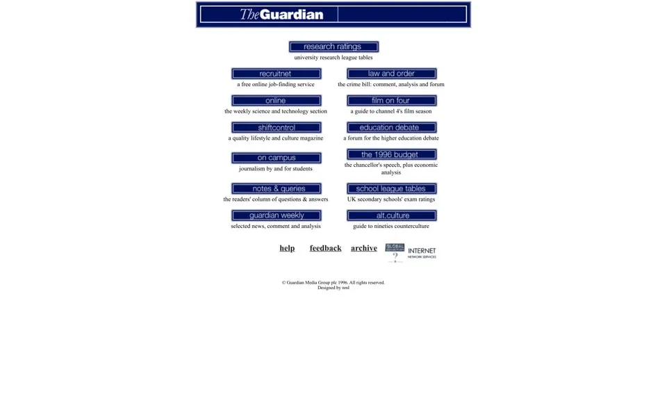
The December 22, 1996 page sits in a narrow column on white. At the top is a navy box with an italic The
and a bold Guardian
. Each button below it has a short caption: a free online job-finding service
for RecruitNet, journalism by and for students
for On Campus, the readers' column of questions & answers
for Notes & Queries.
One button just says online
. Its alt text is more precise, Go2 OnLine
, and its caption calls it the weekly science and technology section
. Go2 had launched in November 1995 as the website of the paper’s OnLine supplement.[1]
The code is labelled by hand, row by row: LINE ONE ITEM ONE
, LINE ONE ITEM TWO
, down to OTHER LINKS AT THE BOTTOM
and COPYRIGHT STUFF
. The copyright line reads © Guardian Media Group plc 1996
, and under it, in tiny type, Designed by nml
. Ian Katz, who worked on the early sites, later remembered the team as the New Media Lab.[2]
The 1997 and 1998 replays we tried show incomplete navigation and missing pictures, so the story jumps to 1999.
1999 Named after a clothing shop
The name came from a little clothing store in Liverpool
. Ian Katz told the story in 2009: after some really bad ideas
, the team found one slightly less bad
, when Simon Waldman shouted that his father once had a shop called Fabrix Unlimited!
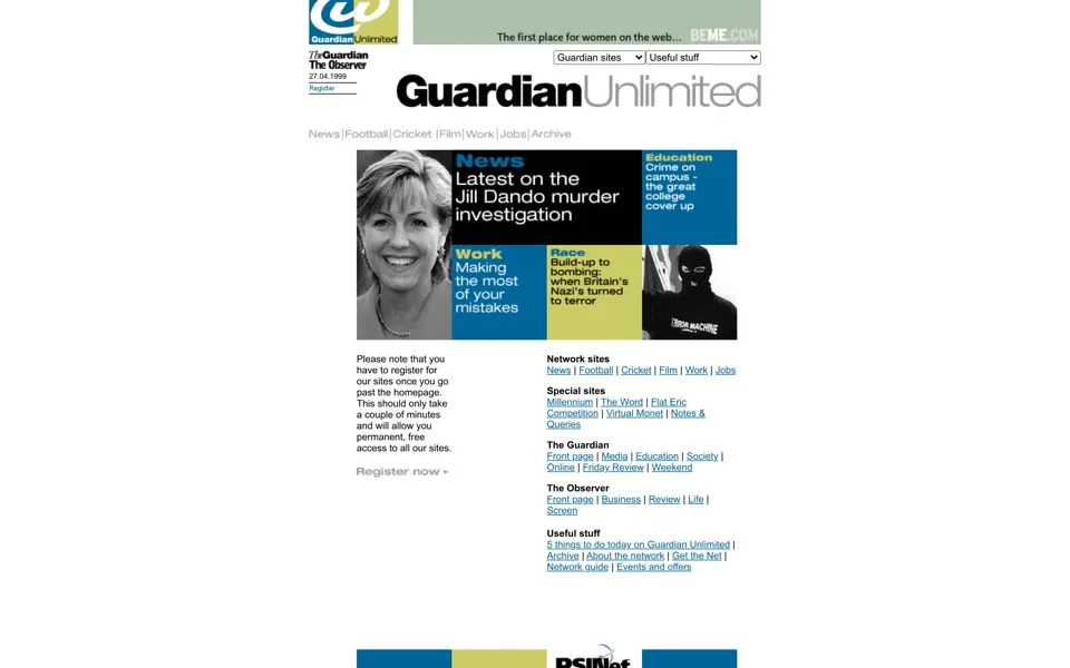
[2] By April 27, 1999 the top of the page says Guardian Unlimited
, in bold black and thin grey letters.
Before the network launched in January 1999,[1] the small team tried almost anything. Ian Katz remembered three moments from 1997.[2]
Ashes 97 · the team sent Test Match Special
a cake, iced to resemble the Ashes 97 homepage, then claret relabelled
Chateau des Cendres
Booker prize · every online book sale arrived as an email, and someone would
leap up and shout "Jim Crace, Quarantine!"
Diana’s death ·
a torrent of callsfrom people looking for coverage, and a rough site, From the Paper,
thrown together in days
Ian Katz, The Guardian, October 23, 2009.
On this page its sites line up as pictures with alt text: News Unlimited
, Football Unlimited
, Cricket Unlimited
, Film Unlimited
, Work Unlimited
, Jobs Unlimited
. The lead tile reads Latest on the Jill Dando murder investigation
. In the left column a note warns: Please note that you have to register for our sites once you go past the homepage.
It promises permanent, free access
.
The code calls the grid of picture tiles a brodyblock
, padded with brody spacer gifs
. Alan Rusbridger wrote in 2021 that the paper went to the designer Neville Brody for the look of Guardian Unlimited.[3] Further down, a programmer left a note: Dropped-in widget here :-)
2000 – 2002 “Was punk rubbish?”
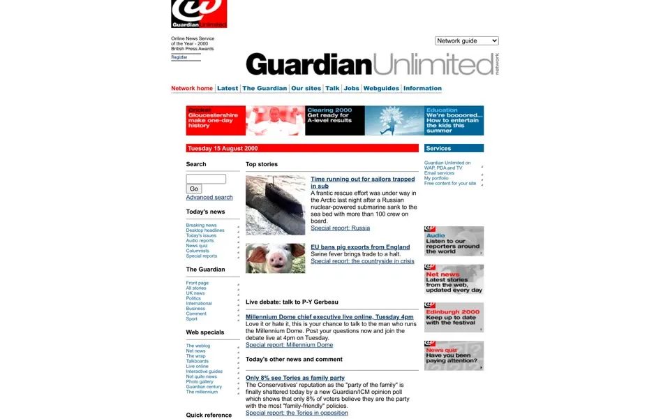
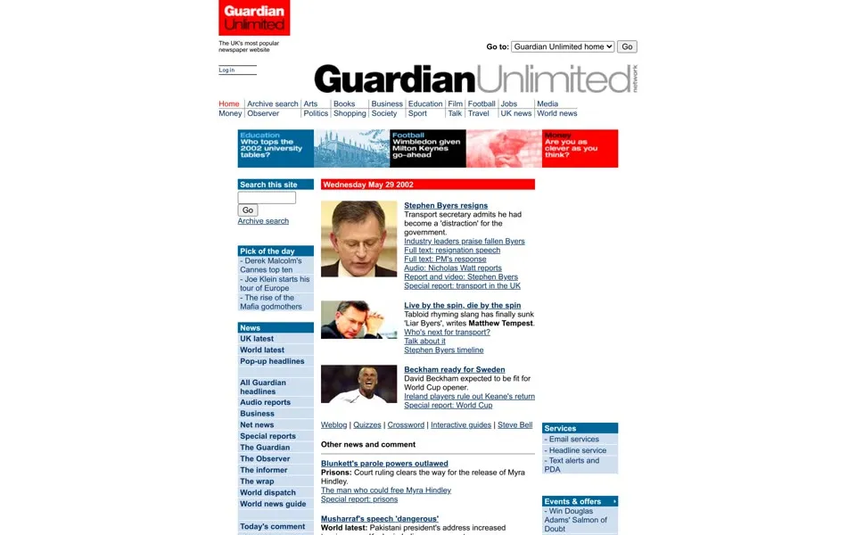
In August 2000 the wordmark grows a small extra word, network
, set vertically after Unlimited
. The menu under it reads Latest
, The Guardian
, Our sites
, Talk
, Jobs
, Webguides
and Information
. Near the top, the page awards itself a line: Online News Service of the Year - 2000
, British Press Awards
. The Network guide
drop-down in its code lists The weblog
between Today's issues
and The wrap
.
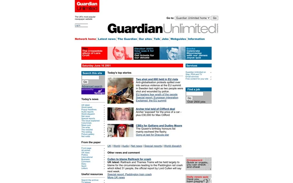
The June 2001 page packs a photograph beside a dense list of news and section links. By May 2002 a red news heading sits over small portrait-led stories, and further down a box points to the talkboards, Britain's liveliest
. Four of its questions: Should regional museums get more cash?
, Should Roy Keane have been sent home from the World Cup?
, Was punk rubbish?
and Should Britain suspend arms sales to Pakistan and India?
The footer of 2002, read from the page’s code, names the company as Guardian Unlimited © Guardian Newspapers Limited 2002
. Keep that line in mind; it changes in 2007.
2003 – 2006 Best daily newspaper on the world wide web
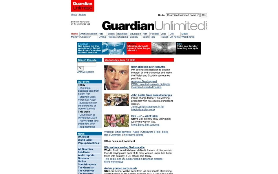
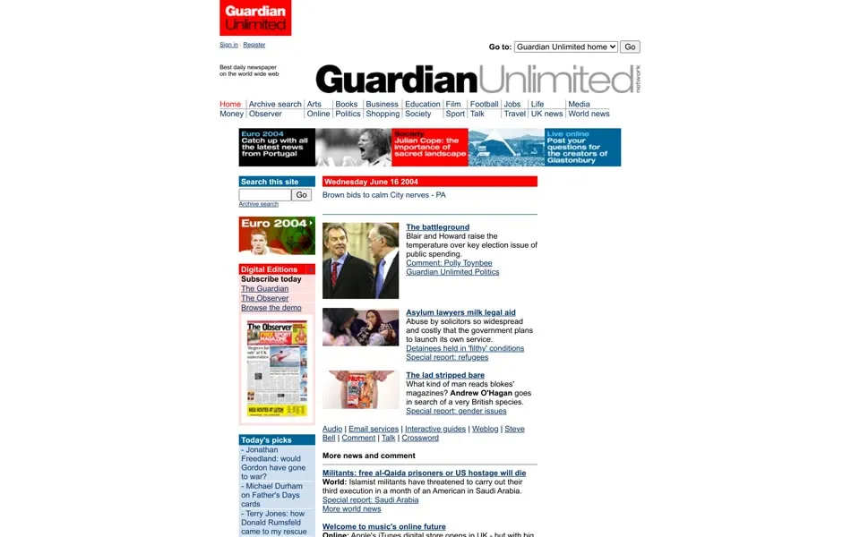
The pages from 2003 to 2006 barely change shape. The June 2003 capture has a large portrait as the lead and section links down the left. In June 2004 a colorful block for Euro 2004 sits beside the news columns; its alt text says Catch up with all the latest news from Portugal
. The menu still has a plain Weblog
link, as it did in 2002.
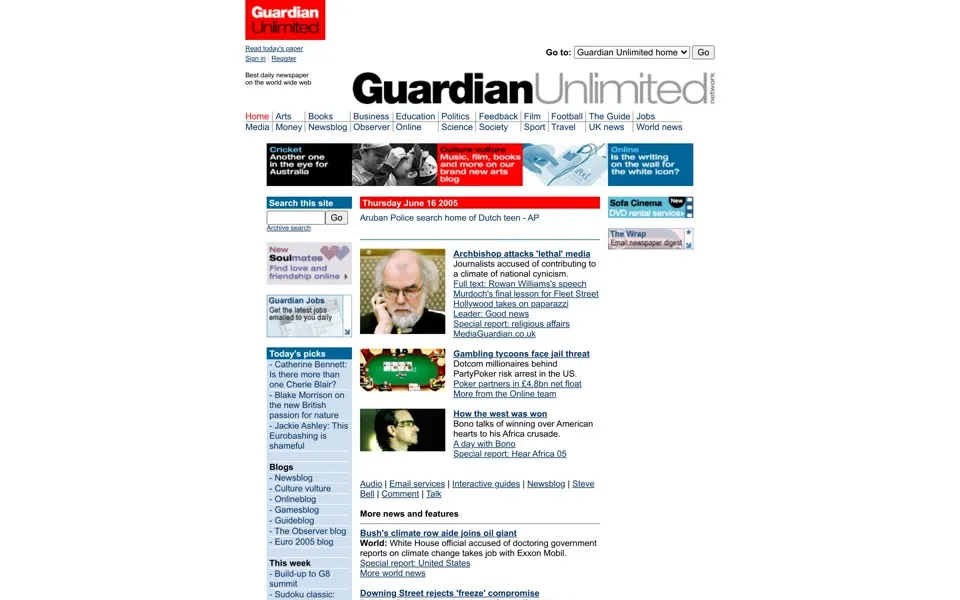
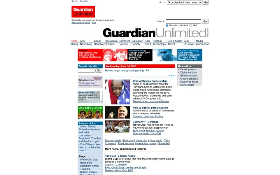
By June 2006 a search box sits above the wordmark, and beside it the page describes itself in one line: Best daily newspaper on the world wide web
. The Go to
menu in its code now includes Comment is free blog
and Newsblog
. Comment is Free had launched that year as an open-ended space for debate, dispute, argument and agreement
.[1]
It is World Cup month. A tile for the World Cup blog carries an alt text with an opinion in it: Cut out the samba hogwash - I'm sick of this Brazil worship
. And an advertising address in the saved HTML contains country=usa
.
2007 Text larger, smaller
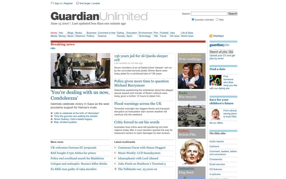
The June 15, 2007 page is wider, and the lead photograph takes up much more of it. On May 10 the Guardian had announced that the homepage takes on a new look
, with wider pages, greater use of pictures and the flexibility of our new design
.[4] The vertical network
has gone from the wordmark.
A grey strip across the top offers Sign in
, Register
and two buttons for the reader’s eyes: Text larger
and smaller
. Under the wordmark the page says when it last changed: June 15 2007 | Last updated less than one minute ago
.
The code has a list of keyboard shortcuts for screen readers. Active ones include Jump to content [s]
, Jump to search [4]
. Others are commented out, among them Jump to accessibility statement [0]
and Jump to contact us [9]
.
The footer in the saved HTML, below our still, has a new company name: Guardian Unlimited © Guardian News and Media Limited 2007
. It is our last capture with Guardian Unlimited in the masthead.
2008 – 2009 Guardian to swap paper for Twitter
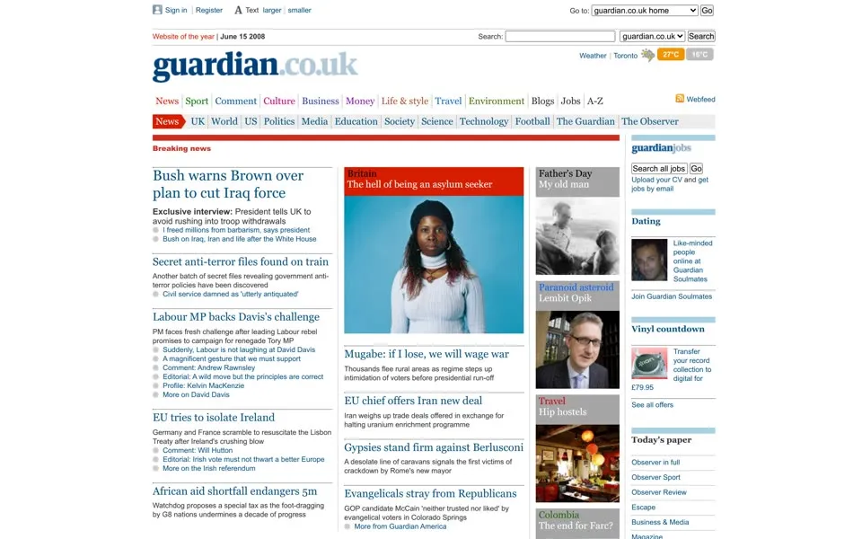
In June 2008 the wordmark reads guardian.co.uk
, with guardian
in dark blue serif letters and .co.uk
in a lighter blue. The site was renamed after its address that year, as part of a rebuild that moved half a million pages into a new format
.[5][6] The browser title is a list of everything on offer: Latest news, sport, business, comment and reviews from the Guardian | guardian.co.uk
.
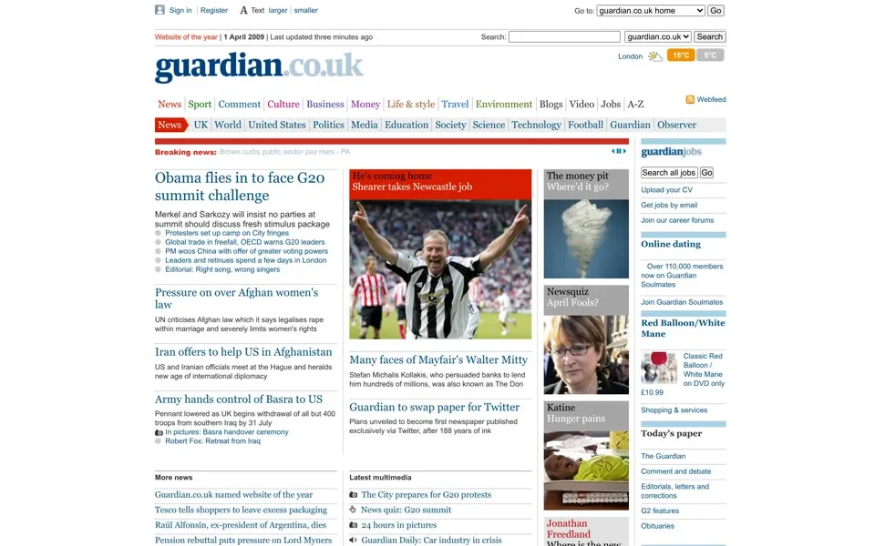
The next capture was saved early on April 1, 2009. Its second column carries a headline, Guardian to swap paper for Twitter
, and a summary: Plans unveiled to become first newspaper published exclusively via Twitter, after 188 years of ink
. The story behind it promised to rewrite the archive, back to 1821, as tweets of 140 characters.[7] It was an April Fools’ joke.
The rest of the page is a normal Wednesday: Obama flies in to face G20 summit challenge
, Last updated three minutes ago
, and a weather box for London, 15°C
and 5°C
, its icon’s alt text reading Mostly sunny
. Keep an eye on that weather box: in later captures its city changes from London to New York and San Francisco.
2000 · Online News Service of the Year - 2000, British Press Awards
2006 · Best daily newspaper on the world wide web
2008 · Website of the year
2009 · Website of the year
2010 · Consumer website of the year
2013 · Website of the year
2014 · Newspaper and website of the year | Winner of the Pulitzer prize
Quoted from the homepage captures in this story.
2010 – 2011 Consumer website of the year
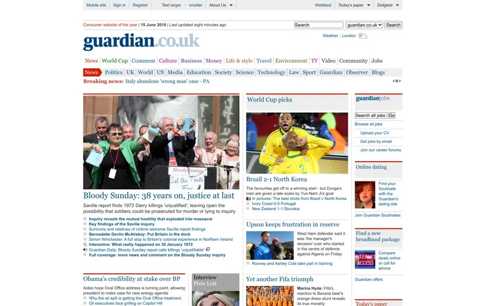
The June 15, 2010 page puts its prize first: Consumer website of the year | 15 June 2010 | Last updated eight minutes ago
. It is World Cup month again, and this time the tournament has its own tab in the top menu, between News
and Comment
. The weather box shows London at 19°C
and 7°C
; its icon’s alt text reads Sunny intervals
.
The grey strip at the very top now begins with Mobile site
. It is still the guardian.co.uk page of 2008, with the same blue serif name, the same red News
tab and the same Text larger · smaller
buttons.
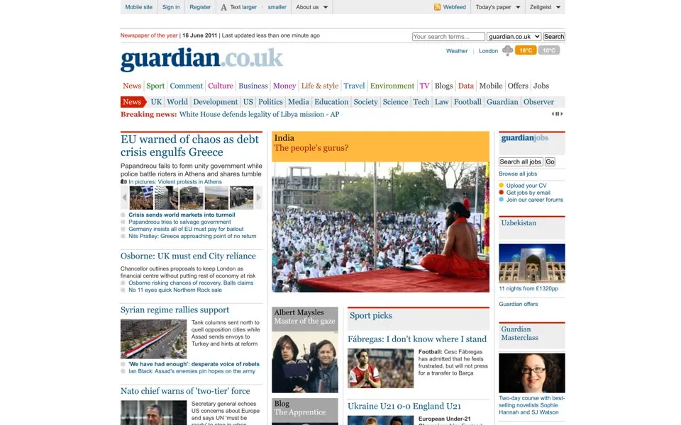
June 2011 looks much the same, with a broad photograph beside the story list and multimedia down the right-hand column. It is our last capture with guardian.co.uk in the masthead; the next one shows the US edition.
2012 – 2013 The NSA files and the angle grinders
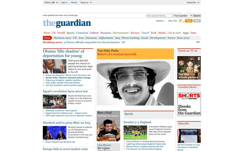
We asked the archive for guardian.co.uk in June 2012 and it served a page from another address. The browser title reads Latest US news, world news, sport and comment from the Guardian | guardiannews.com | The Guardian
. The top bar says Edition: US
, and the weather box has switched to Fahrenheit: New York, 78°F
and 60°F
. The Guardian had opened a US office in 2011, along with a US homepage
.[8]
The wordmark has changed too. The .co.uk
is gone, and a pale blue the
sits in front of guardian
, written as one word.
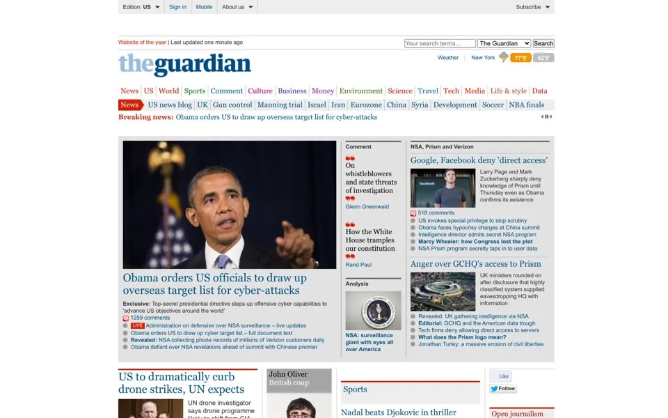
The June 8, 2013 capture is the same US page, with Website of the year
back above the wordmark. Two days earlier the Guardian had reported that the NSA was collecting the phone records of millions of Verizon customers under a secret court order.[9] Here the report is linked under the main story: Revealed: NSA collecting phone records of millions of Verizon customers daily
. Beside it, a box headed NSA, Prism and Verizon
has a link that asks What does the Prism logo mean?
Click that link and the report opens on guardian.co.uk. The byline reads Glenn Greenwald
, The Guardian, Wednesday 5 June 2013
, and the link under it says Jump to comments (2511)
. The column beside it, On the Guardian today
, already leads with the next story, over a slide titled PRISM Collection Details
: NSA taps in to internet giants' systems to mine user data, secret files reveal
.
On July 20 a Guardian editor and a computer expert destroyed the hard drives holding the files with angle grinders, in a basement at King’s Cross, while GCHQ technicians watched; other copies existed outside the country.[10] Ten days later the site moved to one address for every edition: theguardian.com.[8]
2014 A button that says Beta
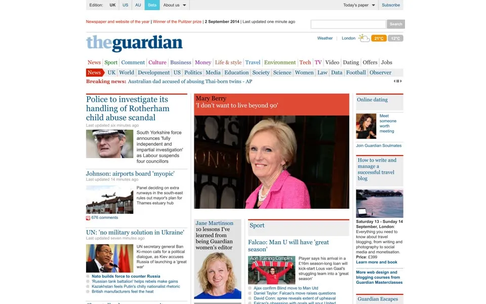
The September 2, 2014 page is the UK edition at the new address, and it is back in London: 21°C
and 12°C
. The line above the wordmark has grown again: Newspaper and website of the year | Winner of the Pulitzer prize | 2 September 2014 | Last updated one minute ago
.
The grey bar at the top lists the editions, UK
, US
and AU
, and then a small cyan button that says Beta
. In the code its name is Switch to beta
. It switched the reader to the next Guardian website, then still being tested in public. From early 2014 a prototype went to 5% of desktop readers around the world, and by launch readers had sent more than 130,000 pieces of detailed feedback
.[11]
Everything else on this page is the old design: the white background, the blue serif theguardian
, the red News
tab, the right-hand column with Online dating
and Join Guardian Soulmates
. It is the last capture in this story with the blue serif name.
2015 – 2017 Nearly 4,400 comments, around 200 from one reader
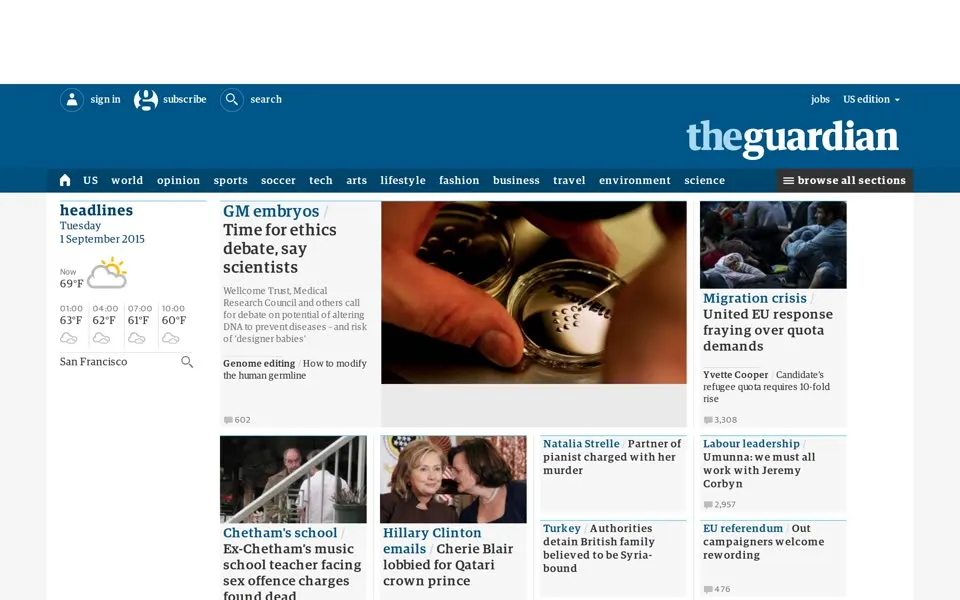
By September 2015 the beta is the homepage. The header is a deep blue bar with theguardian
in white on the right, and the stories come in boxes with colored labels: GM embryos
, Migration crisis
, Labour leadership
. The Guardian called these building blocks containers
.[11] The switch went out in stages, to the US in October 2014, Australia in November, and everyone else on January 28, 2015.[1][12]
Not everyone liked it. Five days after the launch the readers’ editor counted Nearly 4,400 comments
under the announcement, left by more than 1,400 site users, including one commenter who posted around 200 of them
. The same column noted that there had been no dip
in visitors so far.[13]
This page is labelled US edition
, has soccer
in its menu and gives the weather for San Francisco, 69°F
. Its edition menu offers a way out: switch to the International beta
.
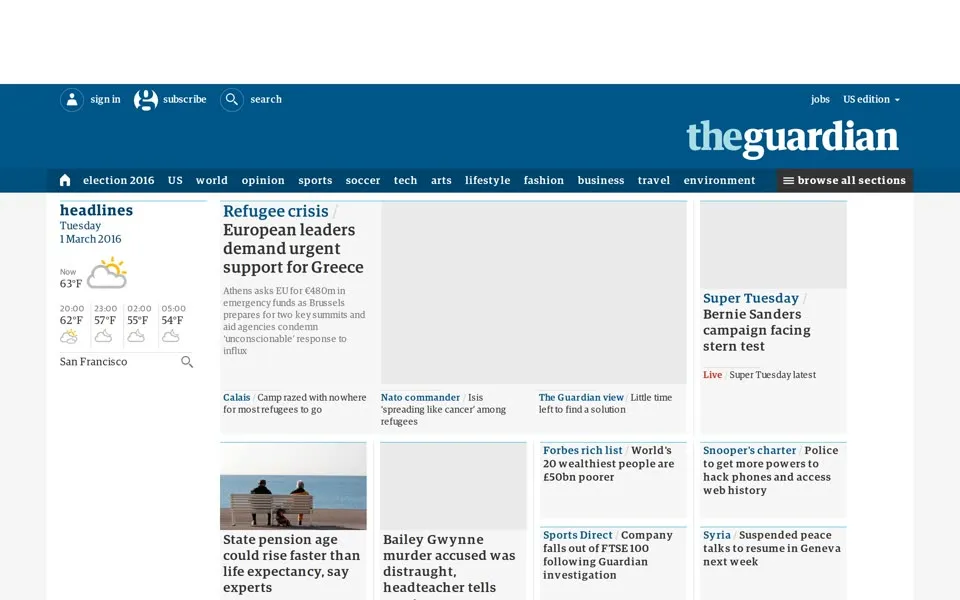
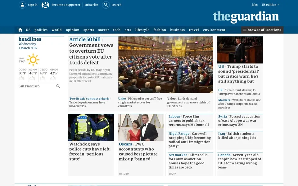
The March 2016 and March 2017 pages keep the blue bar, over the refugee crisis and then Article 50. In our 2016 capture the lead image area is blank grey.
The Verizon report moved into the blue design too, with one addition under the masthead in July 2015: Winner of the Pulitzer prize 2014
. The Guardian and the Washington Post had shared that year’s Pulitzer prize for public service for stories on NSA surveillance
.[17] The section label now says US national security
, the date has gained a time, Thursday 6 June 2013 06.05 EDT
, and the counter beside it still reads 2,511
comments.
2018 The Guardian, on two lines
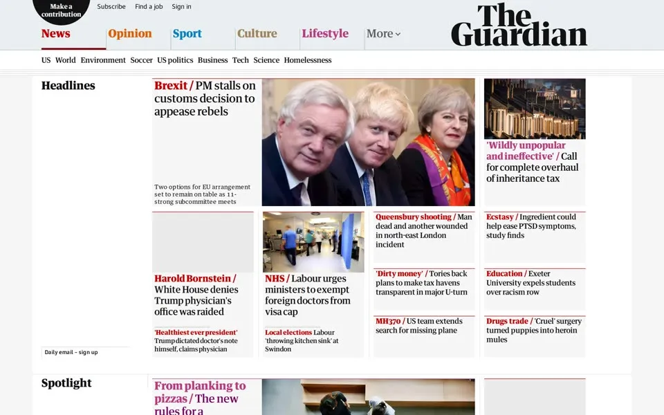
In May 2018 the blue bar is gone. The name is The Guardian
again, in heavy black letters stacked on two lines at the right, and the menu is five words in five colors: News
, Opinion
, Sport
, Culture
, Lifestyle
. The new masthead had replaced the blue and white masthead in use since 2005
.[14] It arrived on January 15, together with the tabloid print edition, and with it a typeface called Guardian Headline, made with Commercial Type.[15]
The top-left corner holds a black circle with three words, Make a contribution
, next to Subscribe
, Find a job
and Sign in
. It is the first capture in this story that asks for a contribution. Six months later the editor, Katharine Viner, announced support from more than a million readers over three years.[16]
The browser title says News, sport and opinion from the Guardian's UK edition
. The edition menu in the page’s code says current edition: US edition
. The same capture carries both.
2019 – 2020 Available for everyone, funded by readers
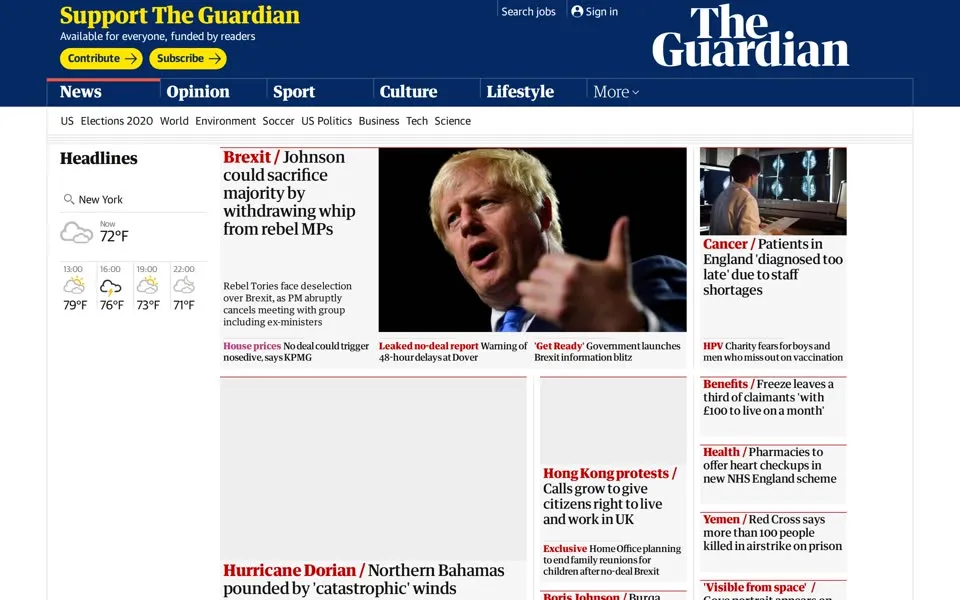
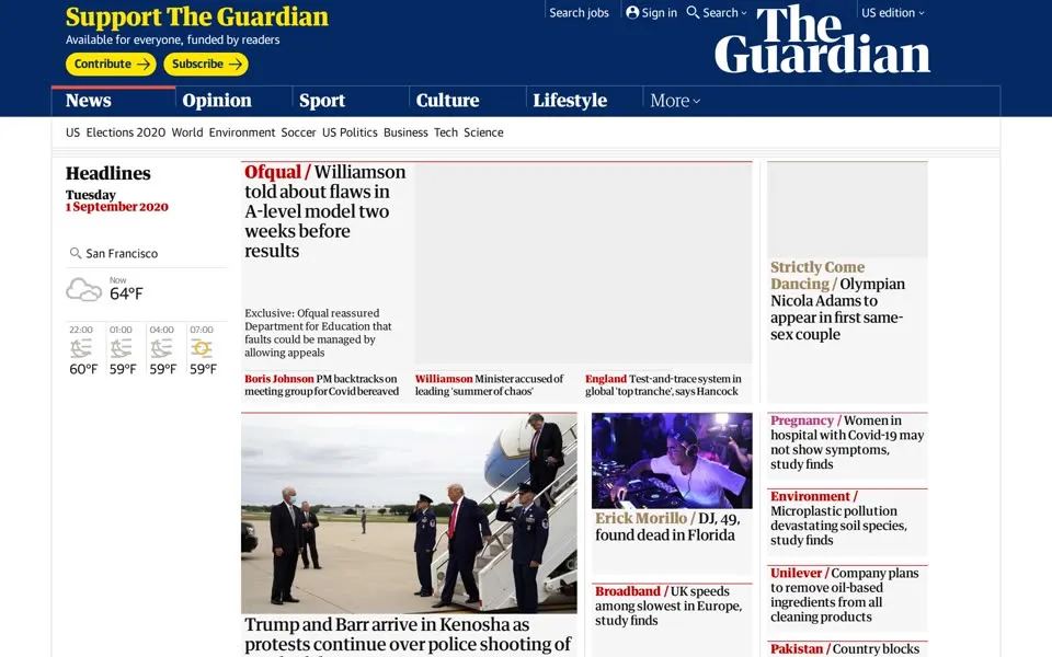
By September 2019 the stacked name is white on navy, and the request has moved to the top left in big serif letters: Support The Guardian
, then Available for everyone, funded by readers
, and two yellow buttons, Contribute
and Subscribe
. The menu under News
starts with US
and Elections 2020
, and the weather box beside the headlines is set to New York, 72°F
.
The Verizon report wears the same header in July 2019, Support The Guardian
included. Above its headline is something new, a yellow label: This article is more than 6 years old
. Its counters read 1,454
shares and 2,504
comments, seven fewer than in 2013 and 2015.
A year later, in September 2020, the header is the same and the weather has moved west again, to San Francisco, 64°F
. The lead story is about A-levels: Williamson told about flaws in A-level model two weeks before results
. Its image area is blank grey in this capture.
15°C
78°F
21°C
69°F
72°F
64°F
AU politics
Midterms 2026
The first six boxes are the weather cities on those captures; the last two are the regional topic labels under the sections.
2021 – 2024 For 200 years
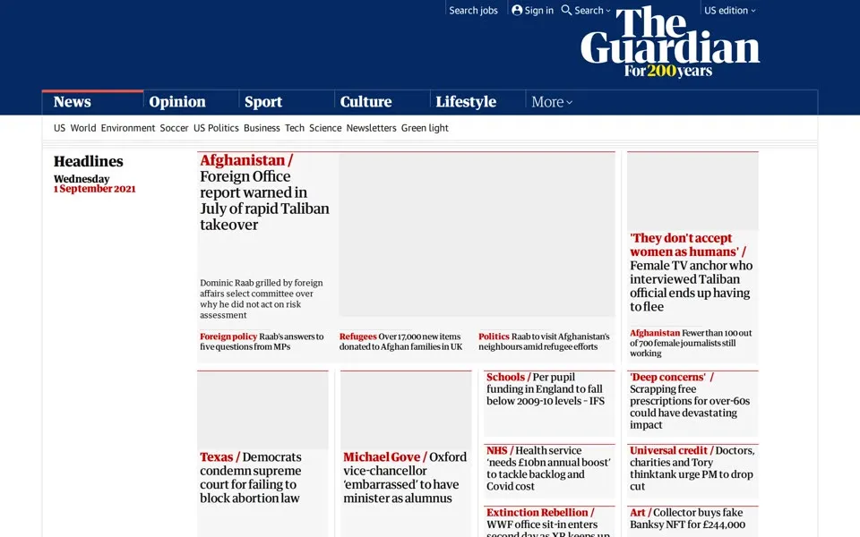
The September 2021 masthead has an extra line under the name: For 200 years
. The paper was founded in Manchester in 1821.[1] That May, in an essay for the anniversary, Alan Rusbridger looked back on the move online and recalled going to Neville Brody.[3] The strapline is gone by the next capture.
In this capture several image areas are blank grey. The headlines are there: Afghanistan / Foreign Office report warned in July of rapid Taliban takeover
, and further down the menu offers Newsletters
and Green light
.
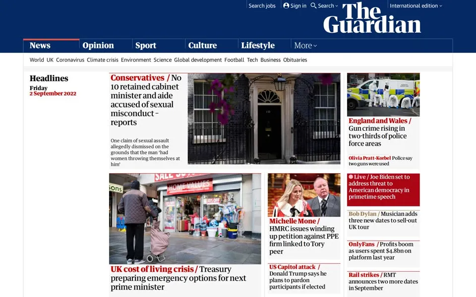
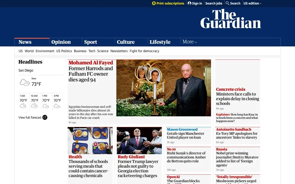
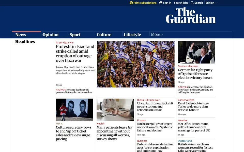
From 2022 to 2024 the navy header changes height from capture to capture. The stacked white name stays at the right, the five sections stay in their places, and the first story gets a large photograph.
2025 – 2026 Five editions in one menu
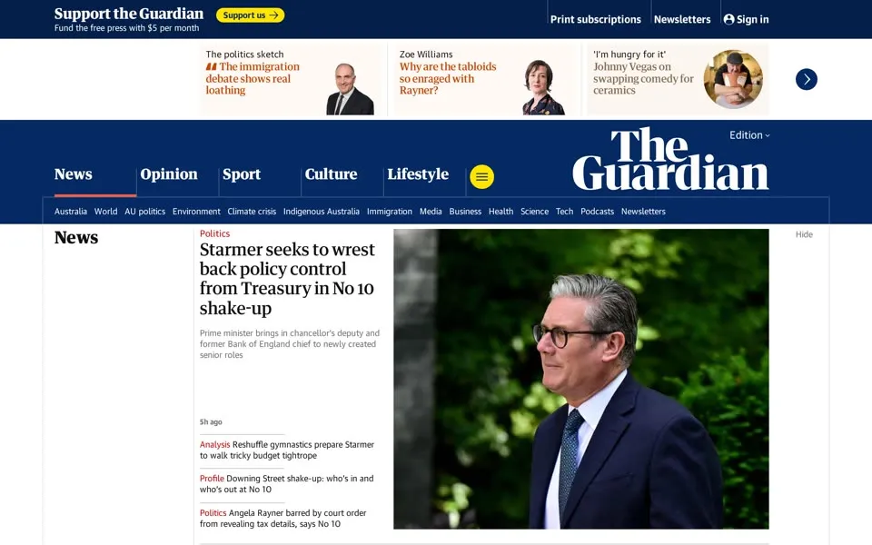
The September 2025 page opens with a strip of columns and features above the masthead and a line at the top left: Support the Guardian
, Fund the free press with $5 per month
. Beside the name a small menu says Edition
. In the code it lists five: Australia edition
, UK edition
, US edition
, Europe edition
and International edition
.
This time the crawler got the Australian one. The row of topics under the sections starts Australia
, World
, AU politics
, and includes Indigenous Australia
, above a lead story about Keir Starmer’s No 10 shake-up.
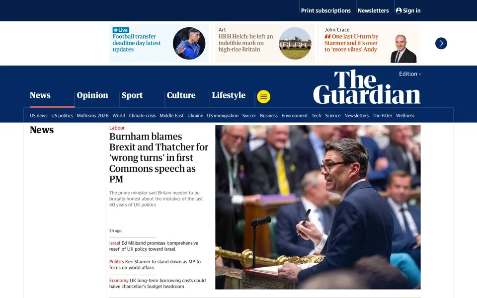
By September 1, 2026 the same row reads US news
, US politics
, Midterms 2026
. The top bar has Print subscriptions
, Newsletters
and Sign in
, and the name sits in the same place as in 2018, white, on two lines.
The Verizon report, captured on June 29, 2026, now says This article is more than 13 years old
. Its time reads 12.05 CEST
, where 2015 and 2019 had 06.05 EDT. The counter still says 2,504
, and under the Share button a new link asks: Prefer the Guardian on Google
. The thumbnails in its Most viewed
column are blank grey circles in this capture.
1999 · Unlimited2026 · The Guardian1996 → 2026 The Guardian, again
The 1996 logo’s alt text is two words, the Guardian
. The 2026 masthead says the same two words. In between, the captures in this story carry three other names: Guardian Unlimited in nine of them, guardian.co.uk in four and theguardian in six. In 1996 the page was called The Guardian and lived at guardian.co.uk; since 2018 the name at the top and the address in the browser say the same thing.
- When was the oldest The Guardian homepage in this story archived?
- The oldest capture here is from December 22, 1996, in the Internet Archive's Wayback Machine. The Guardian’s homepage in December 1996: thirteen navy buttons with short captions, from “the 1996 budget” to “alt.culture”, a guide to nineties counterculture.
- What does the theguardian.com homepage look like in 2026?
- In the newest capture here (September 1, 2026): theguardian.com in September 2026: the navy masthead with The Guardian on two lines and US topics such as “Midterms 2026”.
- How many The Guardian homepage captures does this story show?
- 29 captures between 1996 and 2026, at most one per year; the timeline above shows which years are included.
- How did the The Guardian logo change on its homepage?
- The logo evolution below shows 9 logo versions we picked from the captures, from 1996, 1999, 2000, 2007, 2008, 2012, 2015, 2018 and 2019. Logos from before 1996, the first capture, aren't included.
 1996Italic “The” joins a bold sans-serif Guardian wordmark on navy
 1999Guardian Unlimited combines bold black and thin grey lettering
 2000A small vertical “network” label joins Guardian Unlimited
 2007The vertical “network” label disappears
 2008Blue serif lettering and .co.uk replace Unlimited
 2012Pale blue “the” replaces .co.uk on the US edition wordmark
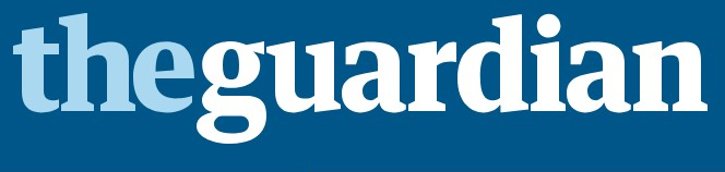 2015The wordmark turns white on a blue masthead
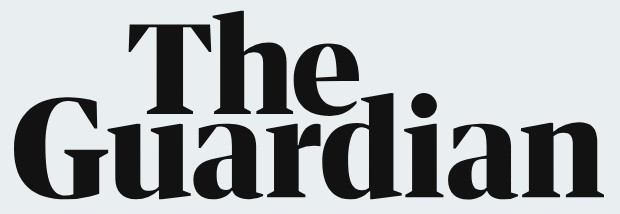 2018The Guardian becomes a black wordmark on two lines
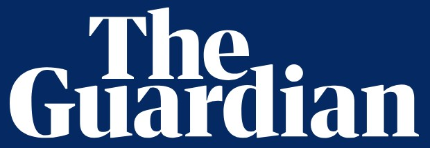 2019The stacked wordmark turns white on navy
Each logo is cut from that year's homepage capture (the year is the capture's); click one to see it on the page. Logos from before the first capture (1996) aren't shown, and some are missing where the logo images don't render in our captures. More logo histories.
◀ drag ▶19962026
The oldest capture in this story (1996) over the newest (2026). Drag across the picture.
Which homepage should we open next?
Tell us on the PageRewind YouTube channel, and subscribe for more histories of the pages we used to visit.
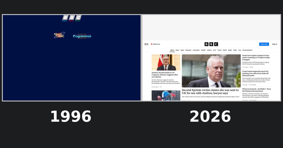 Bbc.co.uk, 1996–2026From “the UK's favourite website” to “Welcome to BBC.com”
Sources
Each screenshot links to its dated Wayback capture. Observations about layouts and wording refer to those screenshots; alt text, closed menus, comments in the code and other details read from a page’s code are identified as such. External history uses the sources below.
- Guardian News & Media archive · Key moments in the Guardian’s history: a timeline: founded in Manchester in 1821; Go2 launched in November 1995 as the website of the OnLine supplement; the Guardian Unlimited network launched in January 1999; Comment is Free launched in 2006; the new site in the US in October 2014 and Australia in November; November 16, 2017. Read source ↗
- The Guardian / Ian Katz · The Guardian’s first forays on to the internet: the New Media Lab, the name Guardian Unlimited and Fabrix Unlimited, the Ashes 97 cake and Chateau des Cendres, Booker prize book sales; October 23, 2009. Read source ↗
- The Guardian / Alan Rusbridger · “It was exhilarating”: how the Guardian went digital – and global (Guardian 200); Neville Brody and the look of Guardian Unlimited; May 6, 2021. Read source ↗
- Guardian Unlimited news blog / Emily Bell · Guardian Unlimited - the next step: the network homepage takes on a new look, with wider pages and greater use of pictures; May 10, 2007. Read source ↗
- Guardian News & Media archive · From New Media to Guardian Unlimited: records of the Guardian’s first years online; the website rebranded and renamed with the guardian.co.uk URL in 2008; November 6, 2019. Read source ↗
- Inside the Guardian blog / Emily Bell · Changes to the Guardian website: moving half a million pages into a new format; February 9, 2008. Read source ↗
- The Guardian / Rio Palof · Twitter switch for Guardian, after 188 years of ink: the April Fools’ story of a newspaper published only via Twitter and an archive rewritten as tweets; April 1, 2009. Read source ↗
- Guardian News & Media press office · Guardian website moves to new global domain: www.theguardian.com, with redirects from old addresses; the US office and US homepage opened in 2011; July 30, 2013. Read source ↗
- The Guardian · NSA collecting phone records of millions of Verizon customers daily; June 6, 2013. Read source ↗
- The Guardian · NSA files: why the Guardian in London destroyed hard drives of leaked files; July 20 in the King’s Cross basement, other copies outside the UK; August 20, 2013. Read source ↗
- Inside the Guardian blog · Welcome to the new Guardian website: a prototype for 5% of desktop readers from early 2014, more than 130,000 pieces of feedback, “containers”; January 28, 2015. Read source ↗
- Guardian News & Media press office · theguardian.com completes global switch to new website; January 28, 2015. Read source ↗
- The Guardian / Chris Elliott, readers’ editor · The readers’ editor on… feedback on the new Guardian website – above and below the line: nearly 4,400 comments by more than 1,400 users, one of them around 200; no dip in visitors so far; February 2, 2015. Read source ↗
- The Guardian · Guardian unveils new masthead before tabloid launch: replacing the blue and white masthead in use since 2005; January 12, 2018. Read source ↗
- Guardian Australia press office · Guardian launches digital redesign to coincide with launch of new Guardian tabloid newspaper: new masthead, the Guardian Headline typeface made with Commercial Type; January 15, 2018. Read source ↗
- The Guardian / Katharine Viner · Financial support from more than one million readers in the last three years; November 12, 2018. Read source ↗
- The Guardian / Ed Pilkington · Guardian and Washington Post win Pulitzer prize for NSA revelations: the Pulitzer prize for public service “for stories on NSA surveillance”; April 14, 2014. Read source ↗
We selected one homepage capture of the Guardian for every year from 1996 to 2026 except 1997 and 1998, 29 in all. Up to 2013 they are captures of guardian.co.uk (the 2012 and 2013 ones were served from guardiannews.com, the US edition’s address then); from 2014 they are captures of theguardian.com/uk. Most come from June or September; 1996 is from December, 1999 from April, 2009 from April 1 and 2016–2018 from March and May. The archive’s 1997 and 1998 copies we tried are missing their navigation and pictures.
The side track is one article, “NSA collecting phone records of millions of Verizon customers daily” (June 6, 2013), shot from four captures: guardian.co.uk on June 7, 2013 and theguardian.com in July 2015, July 2019 and June 2026. The archive’s search index refused our queries for Guardian addresses, so we asked for the page by date and used the capture each request returned. On those captures we hid empty advertising slots.
Each preview is the first screen of a still 1440 CSS pixels wide, captured at 2× resolution; click it for the captured page, up to 2,700 CSS pixels tall, and its Wayback link. The browser frames are illustrations of the eras.
Several captures show blank grey image areas, most visibly the lead pictures of 2016, 2020 and 2021. Many captures show a different regional edition from the one in the address. We hid cookie and consent overlays, empty advertising slots from 2015 on, Flash players, the edition and search controls beside the 2018 and 2019 logos, and a banner offering another regional edition in 2024–2026. Text quoted from a page’s code (alt text, closed menus, comments) is named as such.
PageRewind is independent and is not affiliated with the Guardian or Guardian Media Group. Screenshots and trademarks appear for historical commentary; archived pages are provided by the Internet Archive.
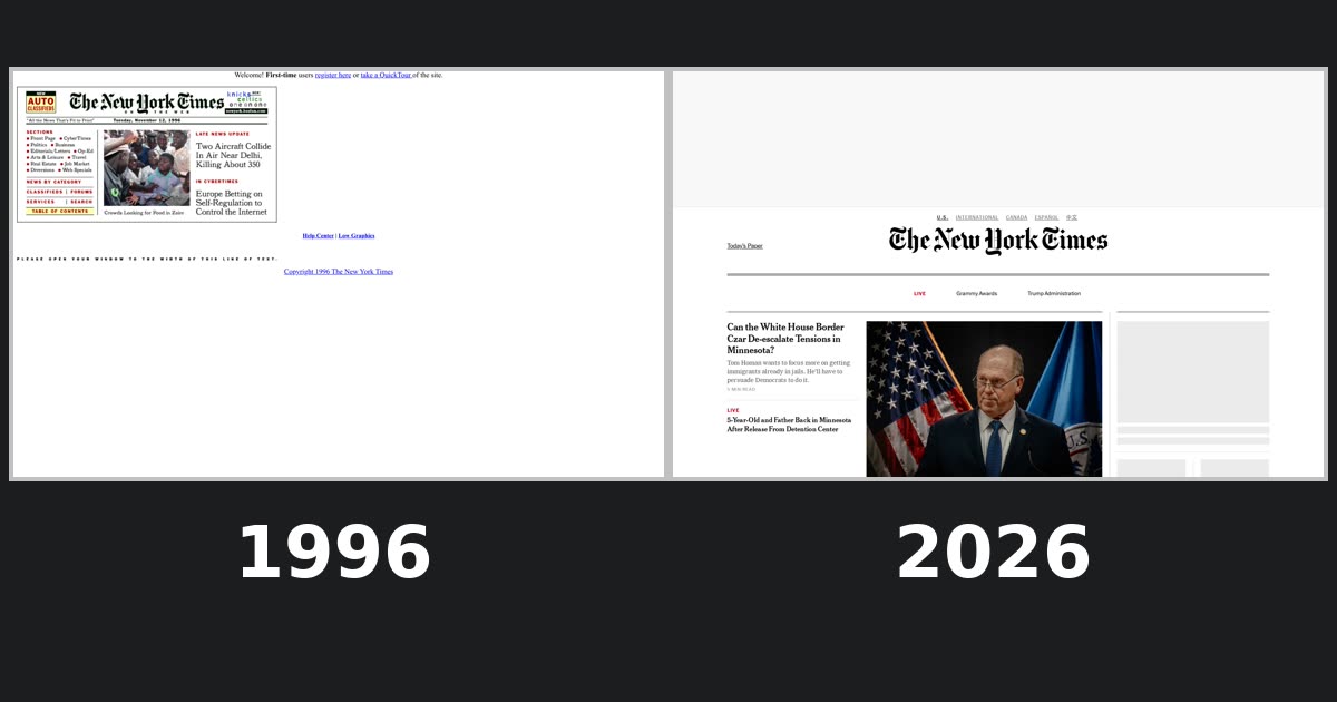 The New York Times homepage history
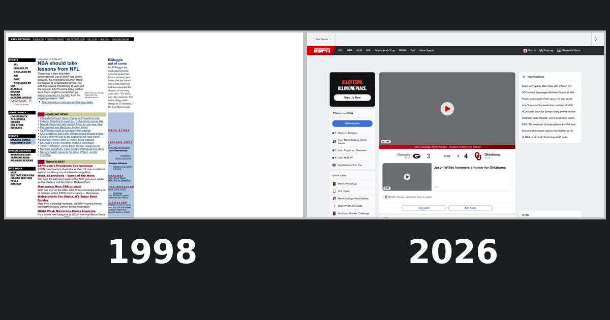 ESPN homepage history