The blue box is back on Gap's October 24, 2010 homepage. Beneath it, a denim campaign says Put the Black in Blue
. Earlier that month, the familiar block had shrunk to a small square beside black lettering.
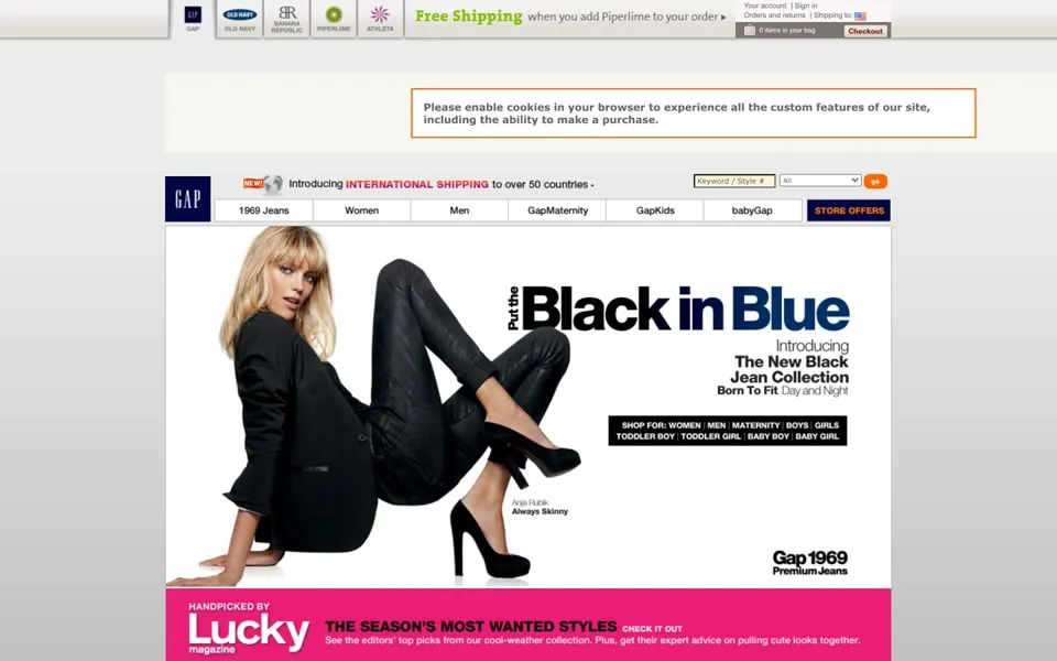
Gap introduced its replacement logo on October 4 and announced the reversal on October 11, 2010.[1][2] Three homepage captures trace the change. The more revealing story is how a request for new ideas ended with customers recovering the old design.
The winter campaign keeps going
Gap's September 29 and October 6, 2010 captures both advertise a WINTER PREVIEW
. Clothing photographs fill the page beneath a row of departments that includes Women, Men, GapMaternity and babyGap, while a message about international shipping runs across the header beside the logo.
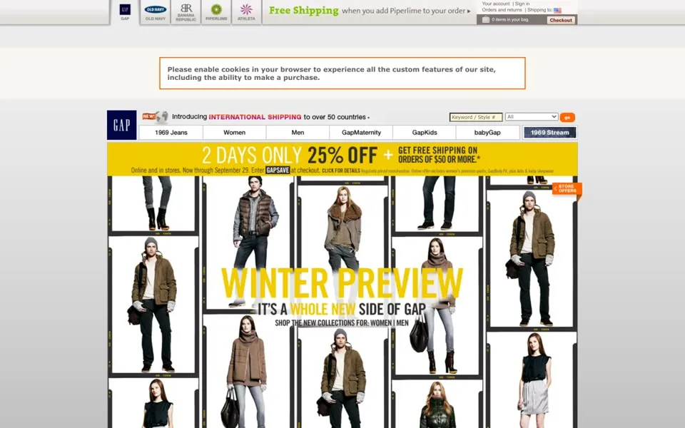
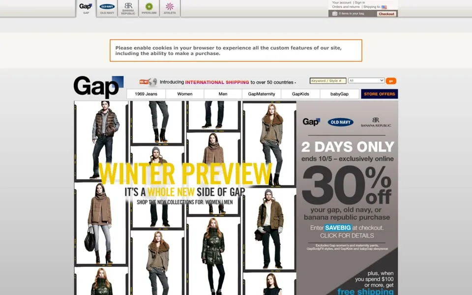
Look at the left end of that navigation. In the September capture, tall white capitals sit inside a dark blue box; in October, black letters spell Gap, with a small blue gradient square overlapping the upper-right corner of the word. The letters have grown. The box has shrunk.
The smaller brand tab at the very top changes too, repeating the replacement among the links to Gap's sister brands so that shoppers encounter it there as well as in the main store header. The product pictures still invite them to browse winter clothes.
Other details vary between the captures, including the discount promotion. The before-and-after comparison places the disputed logo inside the store where customers met it, with everyday merchandising continuing around the change.
New ideas, or the old logo?
Gap's 2010 backlash spread through pages outside its own store. The Guardian reported more than 2,000 Facebook comments criticizing the change, alongside a parody Twitter account and a website that let people make mock versions of the new logo.[3] The design became something people could answer with another design.
Comments put objections in front of the company. The parody account and make-your-own-logo site let the argument travel beyond Gap's Facebook page, where a shopper could join in simply by mocking a design that had already appeared at the top of the store. Gap acknowledged a simpler request: bring the blue box back.
Gap had explored soliciting ideas from the online community. Its October 11 withdrawal statement admitted that it had missed the opportunity to involve people properly, then abandoned the crowdsourcing approach:[2]
The reversal settled which mark would appear above the navigation. Asking the crowd to supply alternatives had not resolved that question.
Blue again, with red still planned
Gap's October 11, 2010 statement committed to dropping the replacement from gap.com and restoring the familiar logo across its channels. It also announced a red version of the box for the holiday campaign.[2] Another change was coming.
Our October 24 homepage, shown at the top of this story, records the blue box back in place thirteen days after the announcement. The winter collage has given way to a large denim photograph. Shoppers see another campaign, under the recovered mark.
That is the extent of the reversal these pages demonstrate: a withdrawn logo and a restored shape. The statement leaves room for seasonal color and future design changes. It does not promise to freeze the store.
Compare Digg's v4 dispute, where the demand for old controls reached into a rewritten news system. Gap's three captures have a much cleaner visual ending. The small gradient square is gone. The white letters are inside the box again.
Compare Gap with six other redesign protests ▸
Watch the Gap chapter
Gap begins at 0:31 in the 10:47 PageRewind film about seven redesign protests.
Sources
The company statement dates the decision; the dated homepage captures show the logos in use.
- Vanity Fair · 2010-10-12 · checked 2026-10-07
- Gap Inc. · 2010-10-11 · checked 2026-10-07
- The Guardian · 2010-10-12 · checked 2026-10-07
- PageRewind: 7 Redesigns That Made Users Fight Back · October 12, 2026 · 10:47
About these captures
These are selected Gap redesign captures from real Wayback replays, dated September 29, October 6 and October 24, 2010. The browser-cookie notice and other visible replay details remain. Images use the existing curated captures and any existing privacy treatment; no page or logo has been reconstructed.
The red holiday box is a plan in Gap's statement, not a fourth capture shown here. PageRewind is independent of Gap. Site designs and campaign images belong to their respective owners.